De Bovenstad, one of the nicest coffee shops in the Netherlands. This place has it all:
- Friendly people
- Good lively vibe
- Plenty of seats
- A big selection of everything
- Great products
So if you're in the neighbourhood, definitely check them out!
Role
De Bovenstad, one of the nicest coffee shops in the Netherlands. This place has it all:
So if you're in the neighbourhood, definitely check them out!
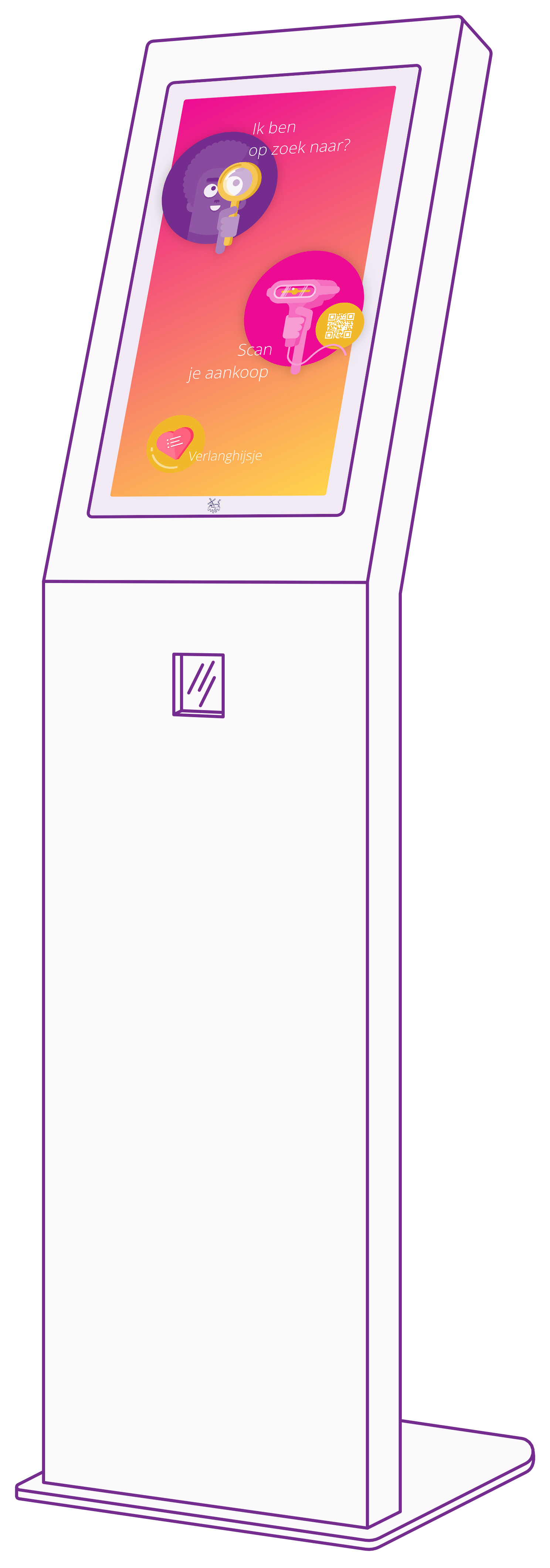
De Bovenstad wanted to make it easier for its customers to choose between the many products that de Bovenstad has. Each product is slightly different and to present this clearly they have placed an information column with an application specially designed for de Bovenstad.
In addition to the design for the application, each product has also been given its own illustration, so that the application and the products have become one.
The application contains:
A vibrant palette with colors that pop.
#742E8E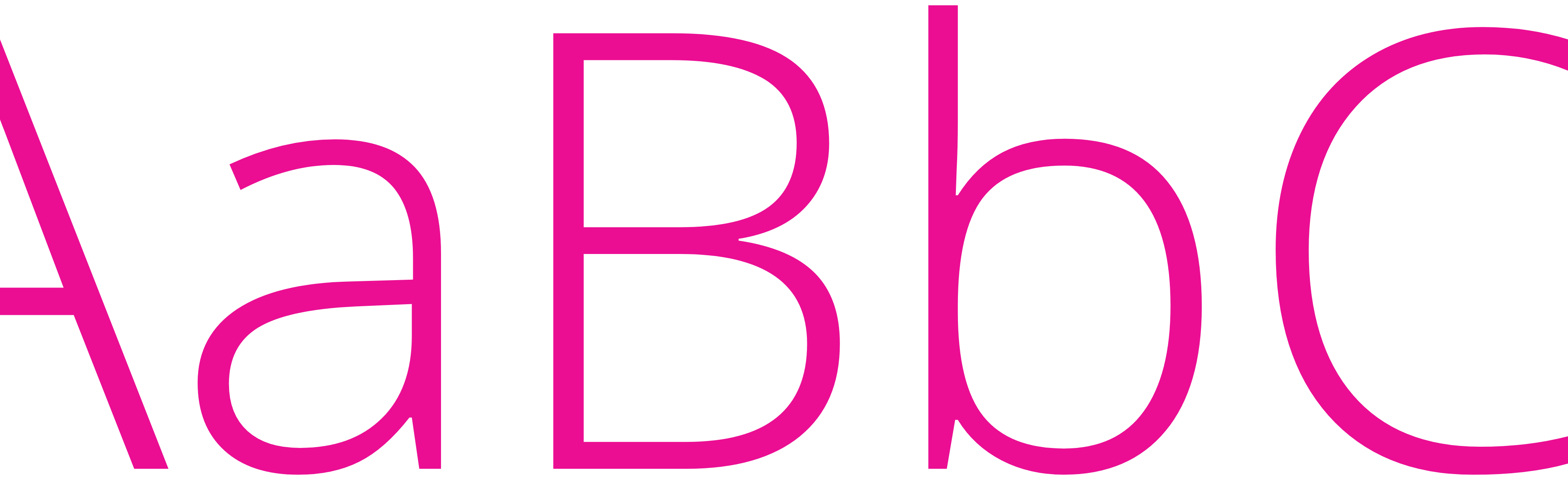
Light, Regular and Bold
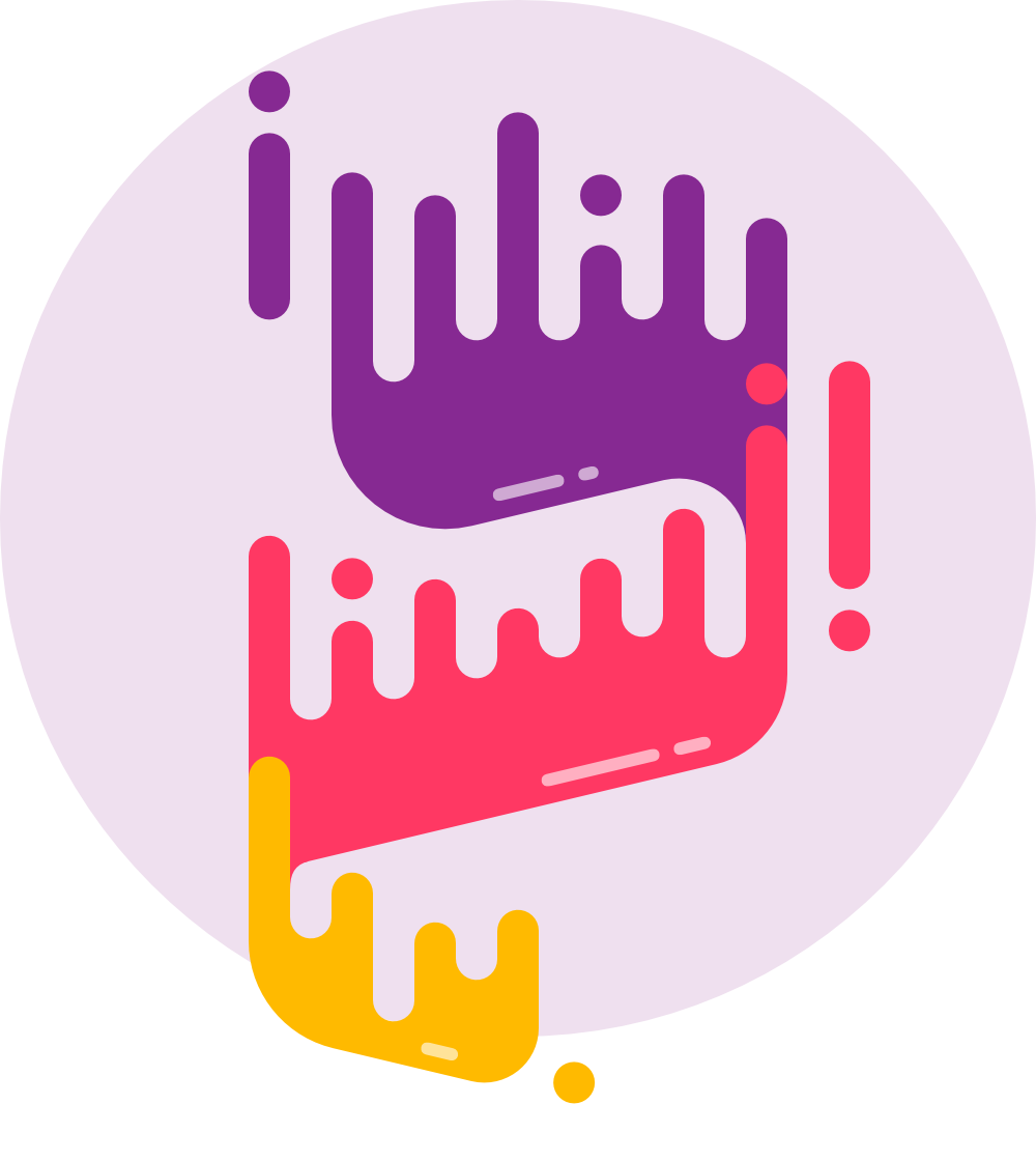
When I started with the new logo design, there was only one condition: The logo must remain recognizable.
So, what do you think?
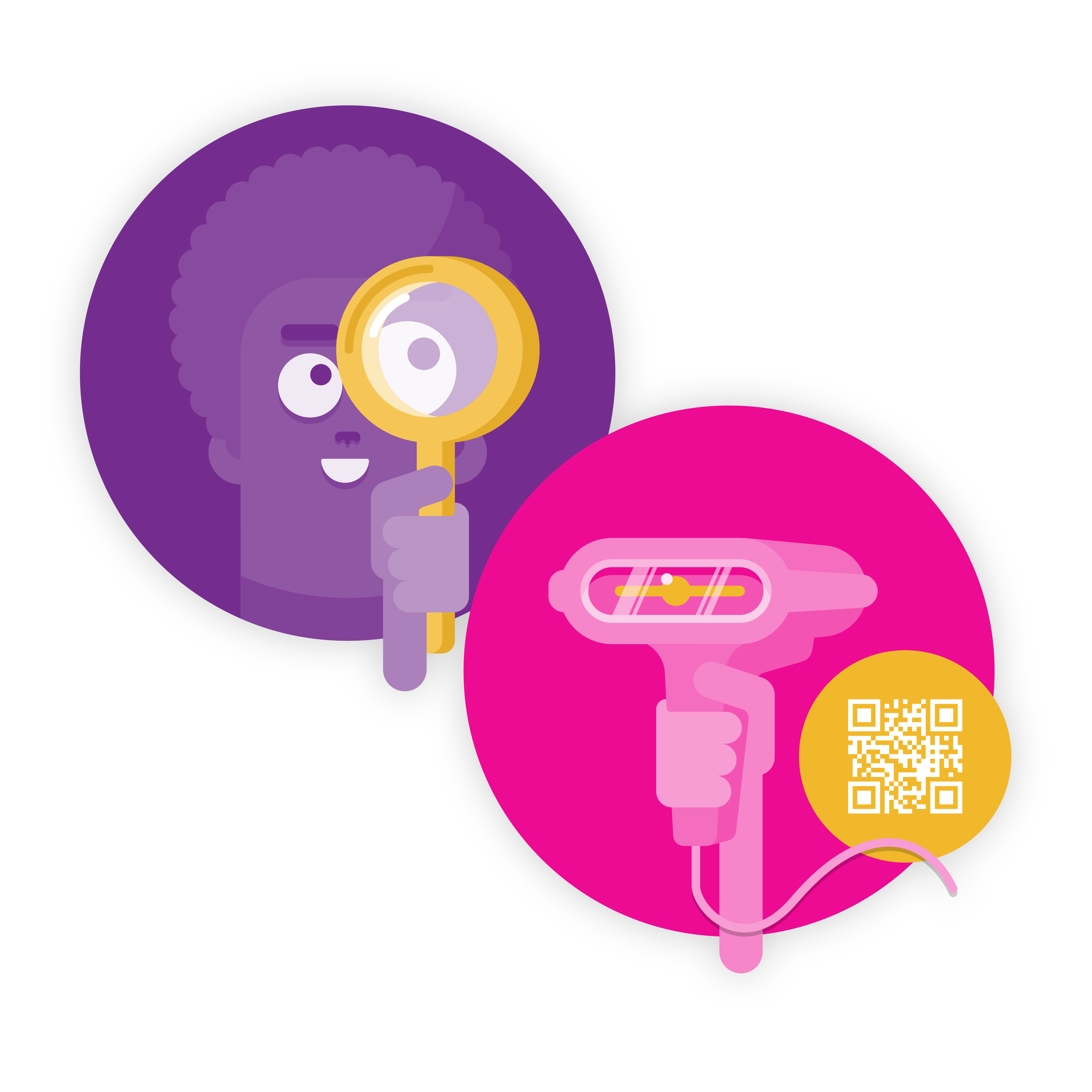
The screensaver ensures that the information kiosk stands out, making customers curious about using the kiosk.
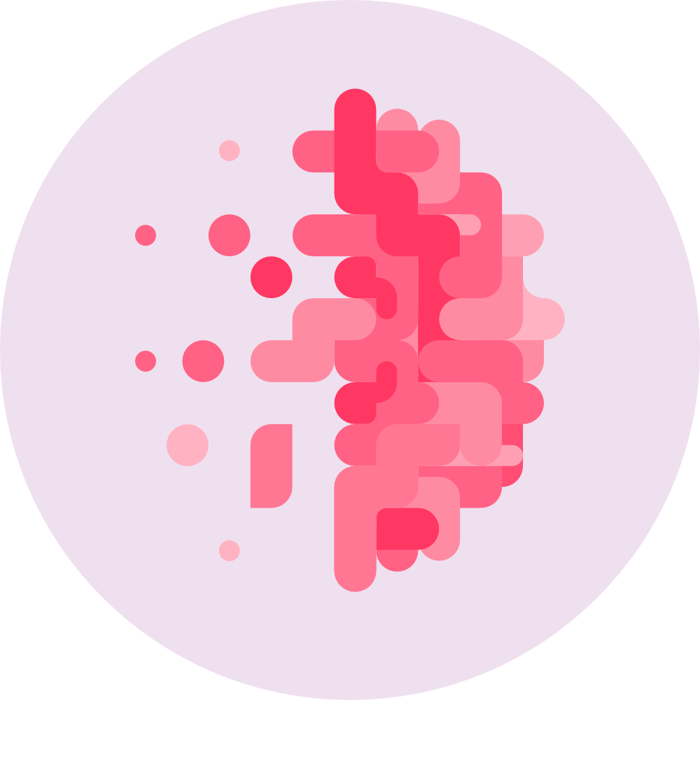
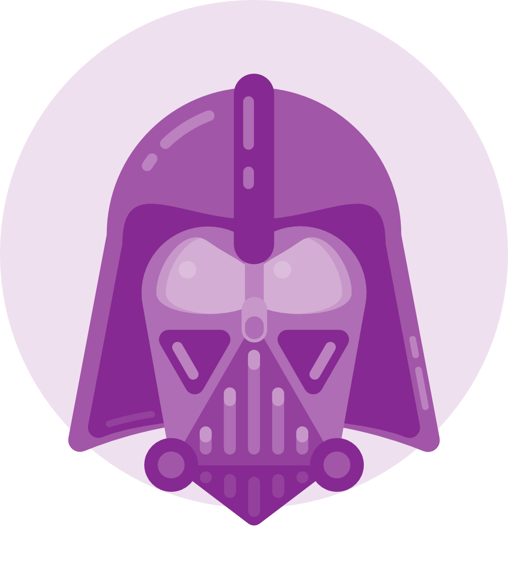
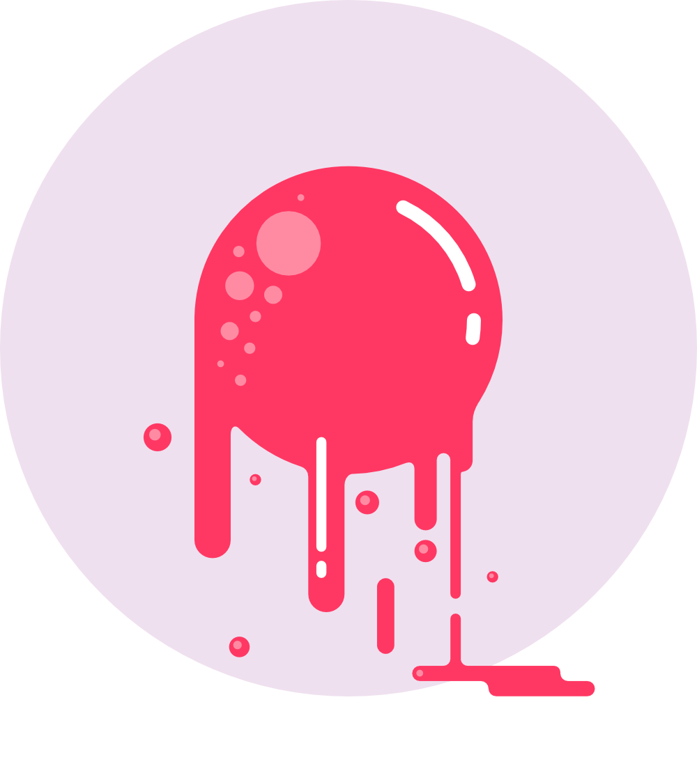
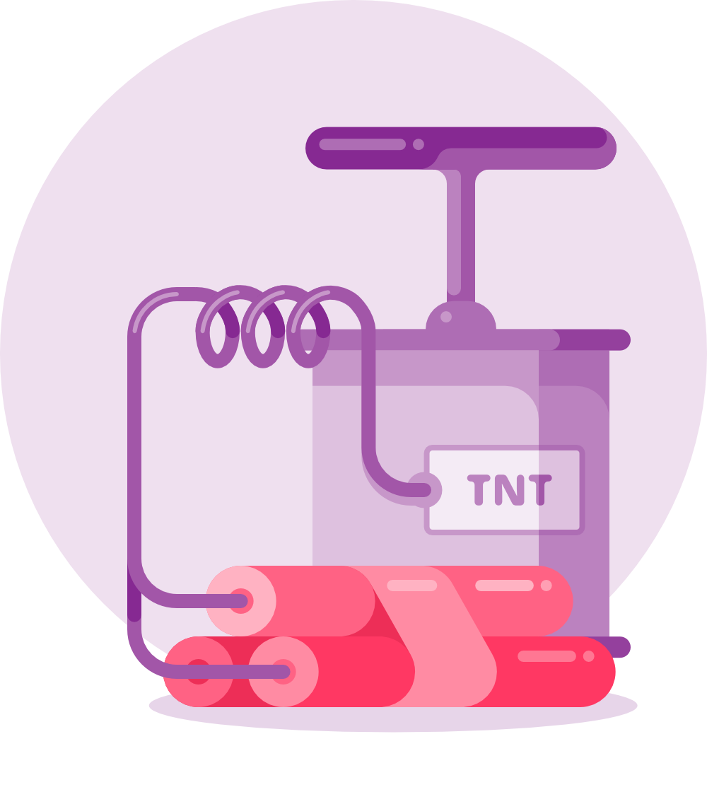
A random selection of the 80+ product images in total.